Climate Change Information and Visualization
These visualizations were put together by Malte Meinshausen of the University of Melbourne and Robert Gieseke of the Potsdam Institute for Climate Impact Research. They show how global temperature, carbon dioxide concentration, and the carbon budget have been changing for the last 150 years as a result of human activity. They clearly display the rapid spiralling of these metrics in the recent past, and they illustrate the connection between our CO2 production and global temperature to the general public in an easy to understand fashion.
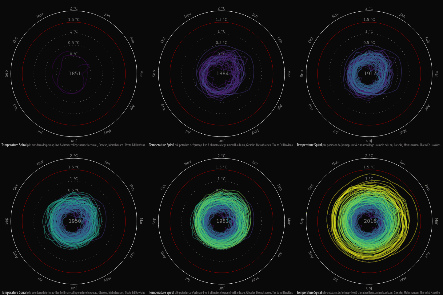
 Global Mean Temperatures Increase Since 1850.
This graph shows the rapid expansion of the mean temperature during all months of the year at an alarming rate. The United Nations Climate Conference in Paris in 2015 set the global goal to keep temperatures within 1.5°C of pre-industrial levels - with 2°C at the absolute most. 2015 was the first year to be above 1°C of pre-industrial levels, and 2016 is likely to be even hotter.
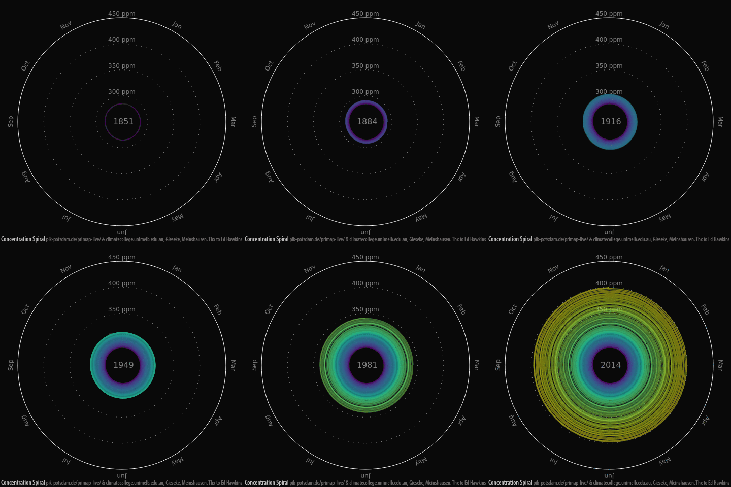
 Global Mean CO2 Concentrations Since 1850.
CO2 plays a vital role in regulating Earth's temperature via the greenhouse effect. Modern CO2 levels are likely the highest they have been in the last 20 million years of Earth's history. CO2 levels were pretty much consistent at 280ppm from about 8,000 BC until the 18th century. Now they have reached 400ppm and are growing at an increasing rate, currently around 2ppm per year. Overly high CO2 concentrations contribute to ocean acidification and global warming. 36 billion tons of CO2 were emitted into the atmosphere in 2014.
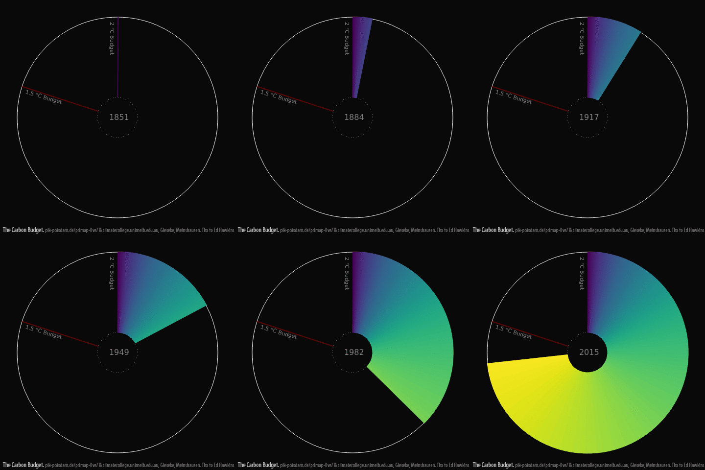
 Use of the Global Carbon Budget.
This graph shows how close we are to the UN-agreed maximum. Nonprofits and scientific organizations like the Global Carbon Project, International Geosphere-Biosphere Program, IHDP, World Climate Research Program, and Diversitas are working to develop a complete picture of the issue and the risks involved, as well as to propose a solution as we hurtle towards an ever warmer future.